STUDIO | DONALD JUDD

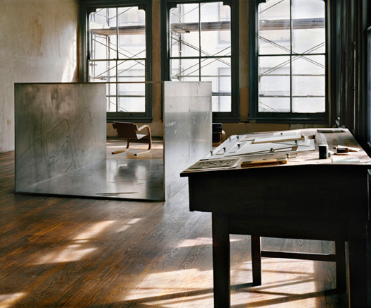
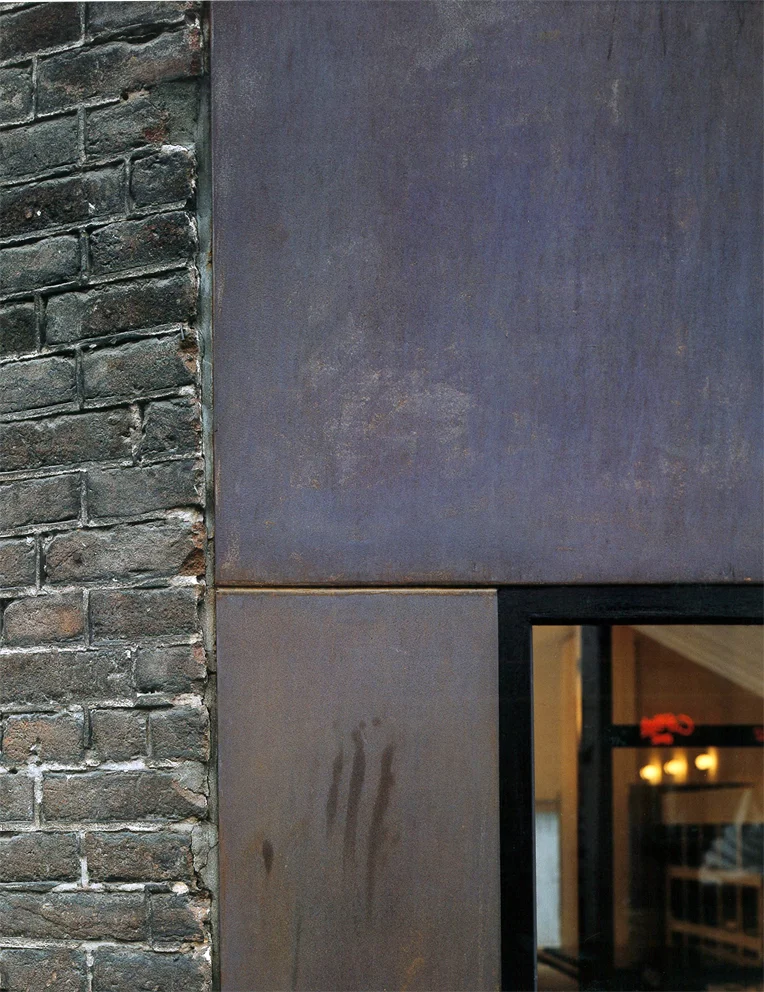
101 Spring Street, Donald Judd | Photograph by Elizabeth Felicella

101 Spring Street, Donald Judd | Photograph by Elizabeth Felicella

The given circumstances were very simple: the floors must be open; the right angle of windows on each floor must not be interrupted; and any changes must be compatible.
— Donald Judd

It was 1968 when Judd purchased a 5-storey cast-iron building at 101 Spring Street. Over the next 25 years, he would renovate the spaces floor by floor, adeptly, with the precision and curatorial eye so evident in his art, and with an immense understanding of the hand of the architect, Nicholas Whyte, who had laid the bones of the building.

Into the vast open spaces he placed objects of personal value, eclectic but also purposefully considered for the space: a 19th-century wood-burner, Aalvar Alto chairs, bend steel sculptures by his own hand. He replaced the windows with double glazing, to protect the art against the dangers of condensation, removed sprinklers, lined shelves with jars and plates as if the everyday utensils were themselves part of some larger art. 

He reflected on the process and place in a 1989 essay entitled, simply, 101 Spring Street, which was reproduced here in Places Journal in 2011. The sincerity and soft hand with which he discusses the project are revealing: the space and materials, rather than his actions upon them, are what give the project value. He does not cry out for attention, but seeks, continuously, to do right by the aesthetic, material and spatial practices available to him. 

As one of the first artists to set up in SoHo in 1968, Judd looked beyond the building, and became deeply involved in the urban politics of the place: co-founding Artists Against the Expressway, actively promoting the Artist-in-Residence destination which changed zoning laws to allow conversion of industrial spaces into live-work studios, and offering up the ground floor of 101 Spring Street for exhibitions, meetings, and performances.

All the energy and care that he projected outwards from his space at 101 Spring St has, some 20 years after his death, been quietly allowed to pour back in. In 2013 his children, Rainer and Flavin, completed their reworking of the building, with an even lighter hand than their father, to bring the building up to code and, in doing so, make it publicly accessible. 

The story of 101 Spring Street revolves around the lives of spaces, the interrelations of art, architecture, and the everyday. It is in the silences, the stillnesses of these great spaces that the value lies. The space is layered, and rich with occupation. But is also reveals something deeper about space, about the permanence of experience, and of how we might be able to capture aspects of a life, such as Judd's, in the way a space is formed, and filled up, and finally, in how it is allowed to breathe.

Everything from the first was intended to be thoroughly considered and to be permanent.
— Donald Judd

FAYLAND HOUSE

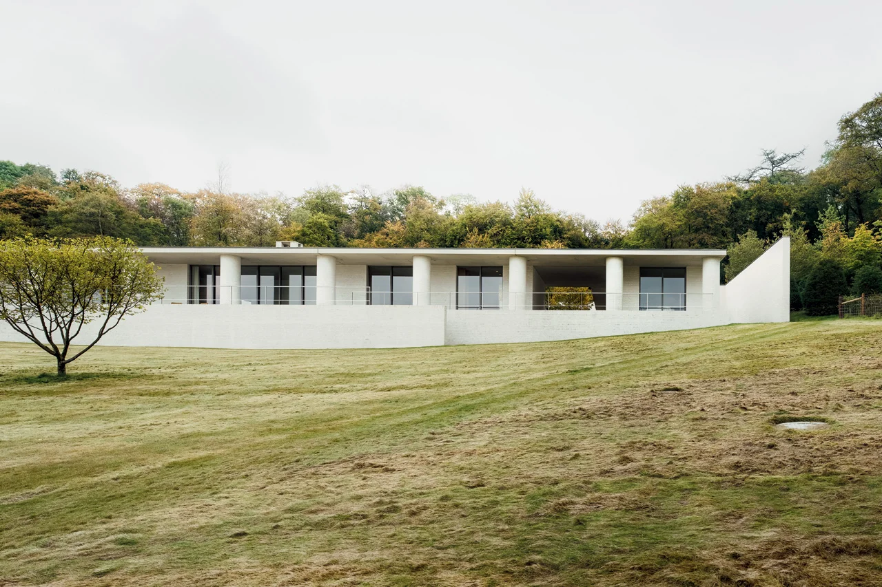
Slung over a sloped field of open ground poised to bloom with wildflowers, David Chipperfield’s Fayland House begins with a concern for context and history. Looking closely, however, the house transcends those qualities in search of a classic timelessness. 

Living spaces languish alongside one another on the front, opening to the view, while ancillary spaces tucked behind rejoice in light from the courtyards. The resulting quiet interplay of interior space and varied landscapes is captured as the camera pans, silently through space in the film. The overlap of view and frame lends a quiet expansiveness to the project. 

But it is the unmodulated run of circular columns along the front of the house which most intrigues us. The chalky, mortar-sponged white-brick is heavy and full and of the earth; with a generosity which extends the house outwards to the sky. Somehow regular and yet surprising, the columns express a classicism which is beyond perception. In an article in Architectural Review, Ellis Woodman perceptively suggested the effect of the columns is similar to the effects cultivated by the work of artist Donald Judd. He concluded his thoughts with a grace so deserved by the building that I cannot help but defer to him here:

The abiding impression is therefore one of invitation to movement. It is a house where one lives on one’s feet and takes pleasure in the constantly shifting relationship to the landscape beyond.

LA FABRICA

A film by Albert Moya via NOWNESS 

It's a strange thing, seeing photographs you have poured over so many times that you are certain you have discovered their deepest intricacies begin to shift before you eyes.

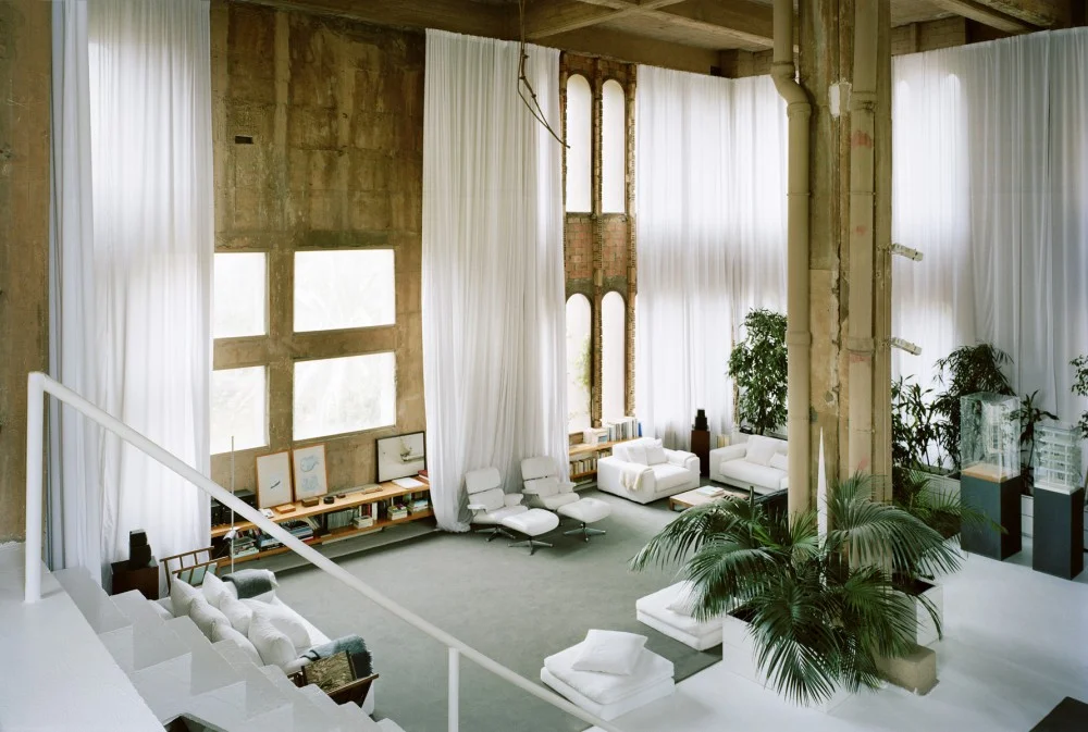
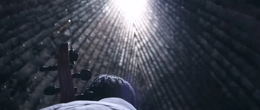
Albert Moya has done a simply beautiful job of transforming one of my favourite collections of images - stills, almost stills, and slow panning shots - into a sense of the quality and sequencing of this immense space. This short film outdoes photographs in ways I could not have imagined.

Within the raw shell - those curtains, that lush greenness, the furnishing! Suddenly Bofill's place has a denseness to it. It is full of space and possibility.

Bofill says it best himself:

It’s here where I know how to live, here where I know how to work
Where I start to think and project, my life is always made up of projections,
because the profession of architecture leads you to project the future,
so this influences your own mind
My life is always a project moving forward,
more than a story from the past

The idea of a space which helps you to understand what it means to march through life as yourself - a space which just fits - that's a fairly wonderful thing to be searching for.


AFTER FOG, ARCHITECTURE

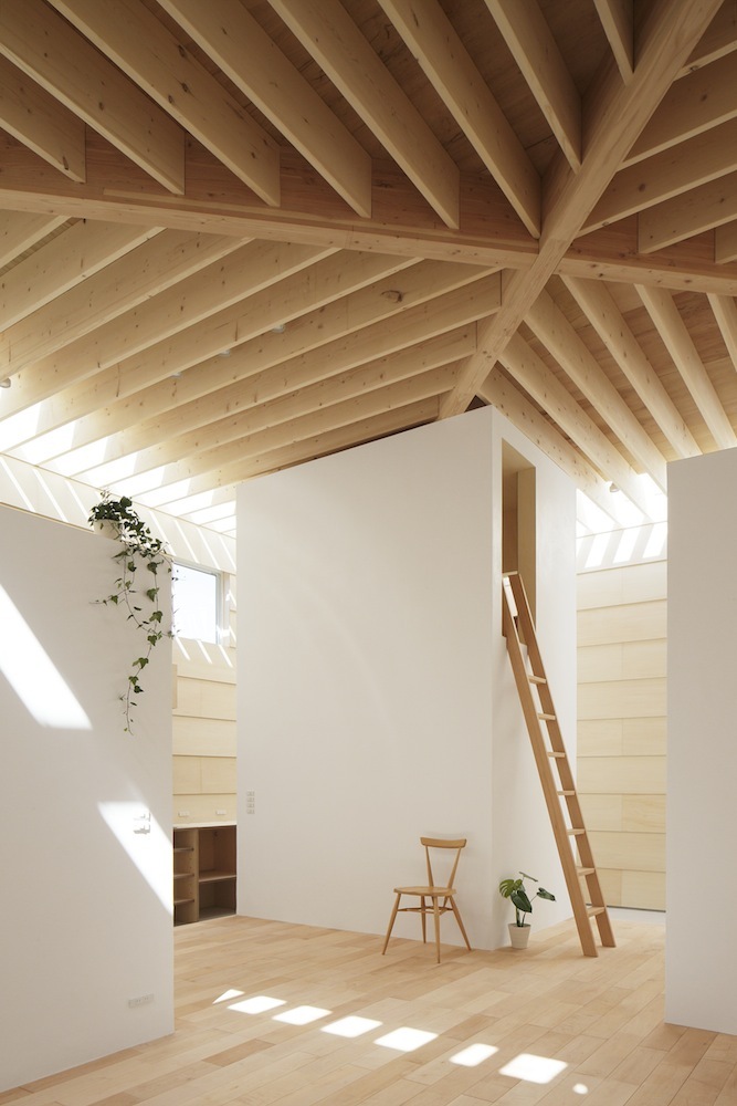
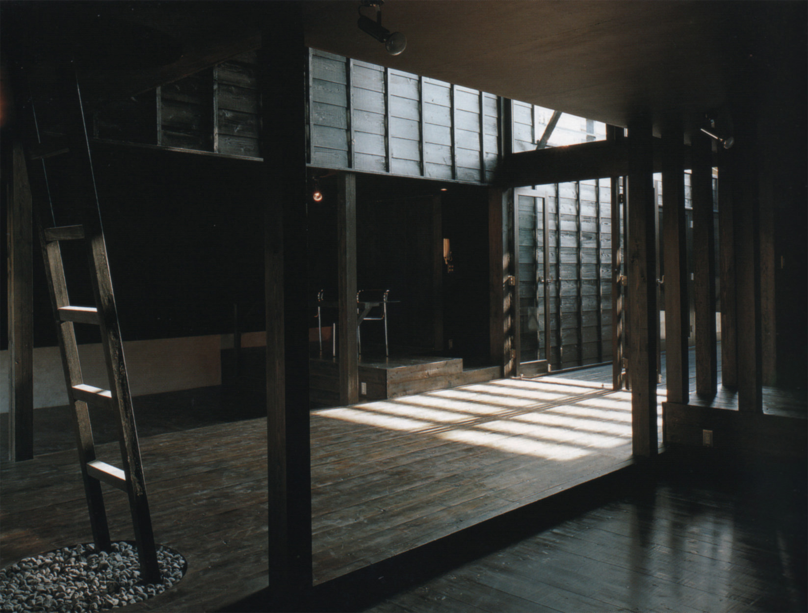
Light Walls House / mA-style Architects / Toyokawa, Japan / 2013

Light Walls House / mA-style Architects / Toyokawa, Japan / 2013

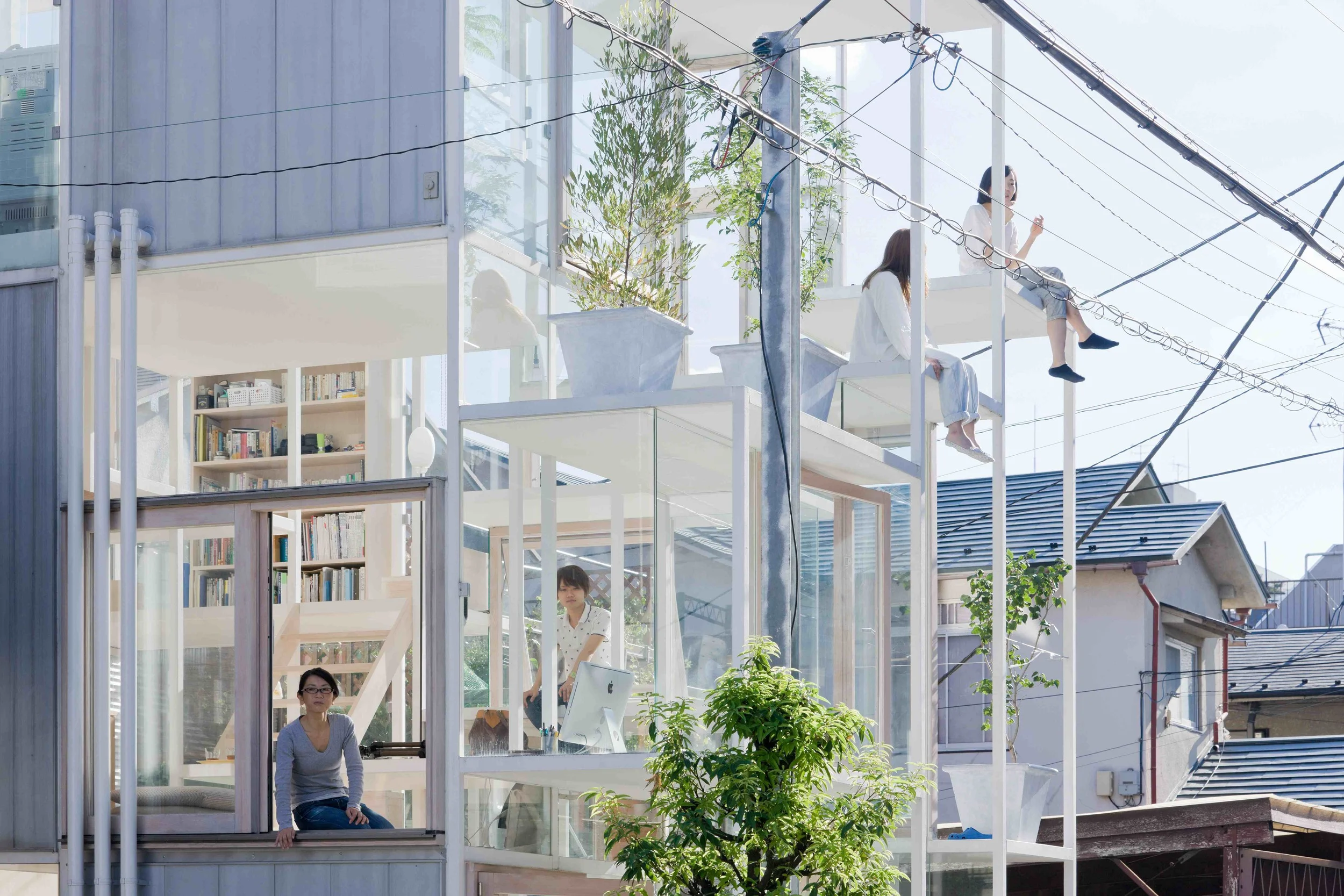
Monday morning, we awoke to a deep fog, and moved our bodies best we could through the narrow visible space by slowly identifying known objects. Door, handle, car, tree trunk, car. For a long while, the sky escaped us.

Later, as the office bathed in the sun of deep winter, the sensation of objects set within thick air stayed with me. I thought about thick space overhead, about articulated ceiling planes and limitless horizons. It's something the Japanese seem to do well, carefully placing discrete, often white cuboids beneath these billowing man-made skies.

Towada Community Plaza/ Kengo Kuma / Towada / 2014

Towada Community Plaza/ Kengo Kuma / Towada / 2014


IN THE LANDSCAPE


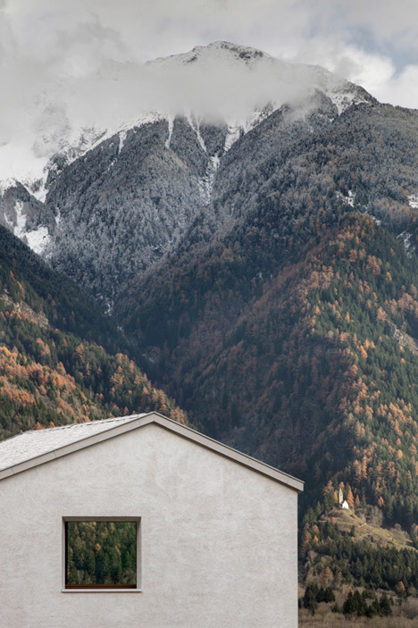
The volumetric and monolithic basic principle was emphasised by the exclusive usage of the white exterior rendering. The main focus lies therefore on the exterior’s elementary colour and the slight nuances achieved by the aggregates in the plaster.
— Frank Oberlerchner, Pedevilla Architects.

The off-white monolithic form of House at Mill Creek appears as object set within and against the landscape. At different proximities, the building reveals itself differently: the triangulated plan, the carefully located square windows set deep and black in the facades, and the subtle depth of texture to the external render. The facade comes alive as light moves across it, echoing the textural density of the forest-clad mountains behind. 

The house reminds us of the mountains, but perhaps more-so of other familiar architectures of the area. The gable roof, articulated eave, and rendered form express known ways of making and being in this landscape, each slightly reconfigured to bring us a composition which warms us with its clarity and sense of the new. 

SECTION HOUSE

Section House - The Cloud Collective, 2010.

Section House - The Cloud Collective, 2010.

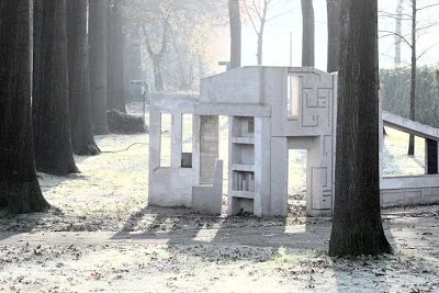
The Cloud Collective's Section House, located on a public green strip in Oisterwijk is just that: a physical, dense section through a typical house. It seems to exist halfway between building site and ruin, halfway between house and playground, halfway between real and unreal.

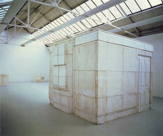
Ghost - Rachel Whiteread.

Ghost - Rachel Whiteread.

It recalls Whiteread's Ghost- though what is given material presence is not negative space, but the cut of the section. We feel, in it, the resistance of lost matter meeting matter. The drawing is firmly in control of the material - the projected slice is given weight beyond itself.

 Catherine Ingraham , in an essay titled Losing It in Architecture has called the architectural drawing a lament. Here, indeed, we see the architect's marks stand in for his absent object, calling it into presence. At the same time, the structure breaks no rules, rather, the logic is misapplied, drawn out from itself. The delight is in what the conventional can allow when we engage with it critically.

The Section House acts as an operator, what Stan Allen might call a 'transaction' between the abstract realm of geometry and the material stuff of building. 

COA MUSEUM

TheLimnCOAMuseum.jpg

The triangular volume of Cabilo Rabelo's COA Museum sits an installation in the landscape, a large scale, monolithic piece of land art. Emerging from the ground, the simple, raw materials evoke the local stone yards and reflects two different natures: the concrete’s matter, and the local stone’s texture and colour. Then suddenly, just as you are certain of its solidity, it seems, improbably, to be released: the building floats out over the landscape, hovering, as if it weighed nothing.

A museum which reflects its context and content, forming a background and a foreground at once. It’s value is subtle, intrinsic, and undeniable.

Find out more about this beauty here, on ArchDaily.

PALAZZO DELLA CIVILITA DEL LAVORO

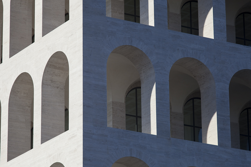
Palazzo della Civilita del Lavoro as captured by Architectural Photographer Claudio Olivia.

Palazzo della Civilita del Lavoro as captured by Architectural Photographer Claudio Olivia.

Planned for the 1942 World Exhibition as a celebration of the Colloseum, the iconic pallazo was Mussolini’s architectural symbol of his Fascist world. In simplified neo-classical style, the superimposed loggias of the travertine-marble clad building make it as distinctive as it is mesmerising.

This year, fashion giants Fendi took over space as their headquarters, and will inhabit it for the next 15 years at least. Fendi intend on opening the ground floor up to house exhibitions celebrating Italian craftsmanship.

Palazzo della Civilita del Lavoro as captured by Architectural Photographer Claudio Olivia.

Palazzo della Civilita del Lavoro as captured by Architectural Photographer Claudio Olivia.