How we come back

How we come back

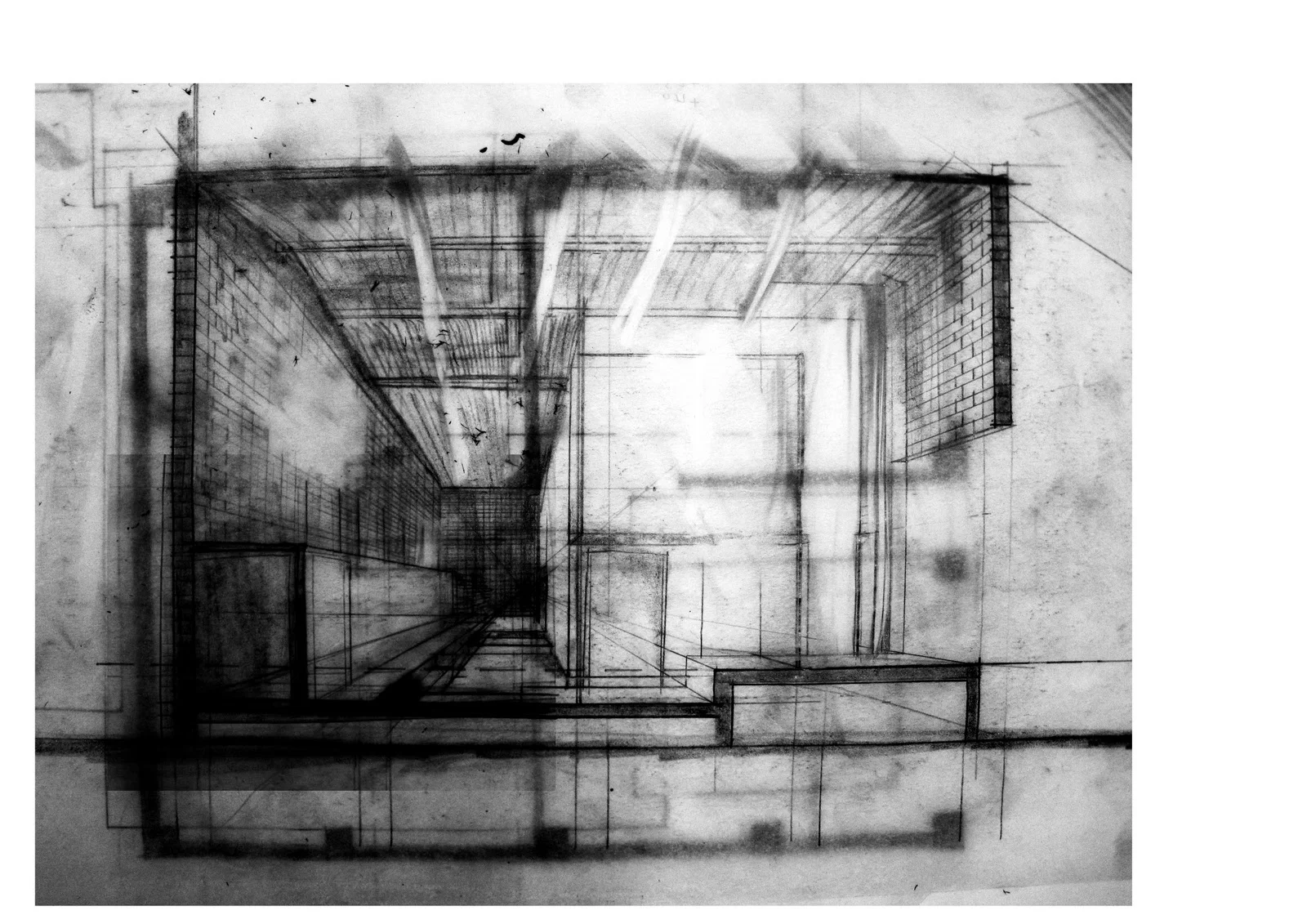
Sketches of the Musee d’Orsay, August 2017

As a child, you can get close enough that the strokes become strong and dissolve the image. This close, you don’t need much imagination. You see plants, you see their reflections. You quickly forget the room around you.

I remember that feeling of trying to tie it all together with what I had learnt of lilies. I had studied them at the local horticultural hall in preparation, yet the way the canvas seemed to expand made it difficult to understand. There was no horizon, no sky, nothing else beyond the plants in their water.  Just atmosphere and my breath, slow against the blues.

——————

This isn’t a complicated tale, except for the way it layers. There’s a particular way the mind, transcribing moments, sets them down as translucent sheets atop one another. Or, to picture it differently, if each journey is a canvas, each canvas is disguised by the brush that traces its surface. The composition of any memory is a painterly mix. It’s when you look back, trying to separate the coats, that the edges of time begin to curl, and the layers begin to separate strangely. I’ve spent hours trying to squint into this space, to unfurl the beginning of my journey. Things come in and out of focus quickly. They’re all just impressions. It feels like an impossible thing but I keep trying to hold it all at once.

Sometimes it feels simplest to start historically. But with whose history? I could always start by tracing my own footsteps, to go back to that surreal age when nothing bad had ever happened to me. What do I remember? An art teacher with a kind face. A mother who encouraged. The hues of the summer sun setting in the south, seen through a slit in the purple patterned curtains, when I was supposed to be sleeping.

One moment in particular comes to mind: my small body close to the wooden floor, the space gold-tinted, perhaps by the sun, or perhaps by the light of a lamp on the desk to the left. Newspapers spread, open across the floor, with large, thick rectangles of white paper arranged on top of them. Hunched over one of them, my whole arm sweeping across the surface, I painted in thick, bold strokes. Those paintings are still in the attic, somewhere, curling under the weight of the golden grasses, dense sunsets, and the deep blue shadows I had understood from my copy of the History of Impressionism.

That’s the first reminder that my history isn’t all mine. In 1986, three years before I was born, a building on the banks of the Seine was reincarnated. Actually, the process was slower and undoubtedly more tumultuous than those words make it seem.  Many were not convinced by the unnatural transformation of the Beaux-Arts building, finding something awkward in the way the new interior filled in the precious voids, disguising the structural strength.

When I arrived here for the first time, and stood at the bottom of the spectacular space that is known as one of Paris's great 19th-century rooms, I wasn’t aware of the architectural criticisms, the historic correctness. At twelve years old, in Europe for the first time, I found my eyes catching on the sparkling edges of things. I must have walked around on tiptoes, trying to get to the centre of things. Mostly, I found, you can imagine what things might have been. A paving stone here, an entry there, the great cavernous belly now filled with bodies - bronze, stone and the living - instead of the engines of  steam trains. And at night, an image history can’t shake: the glowing face of the great clock telling you the time.

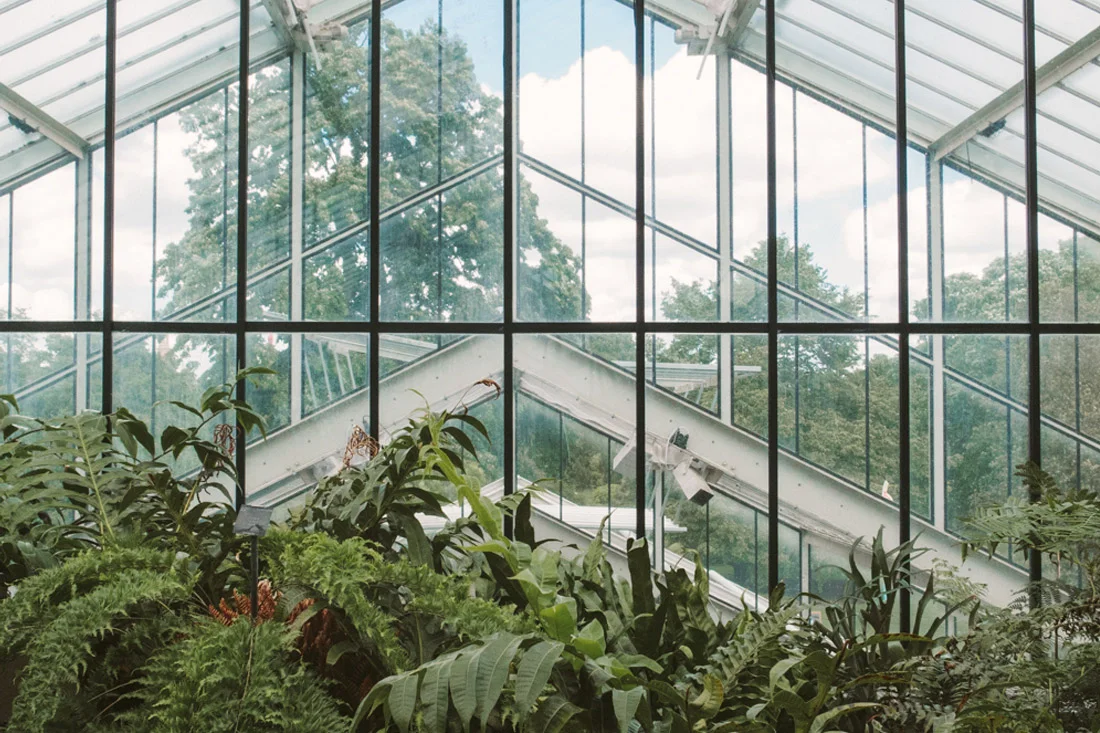
On the flanks, in this new arrangement, there are hidden spaces that I now think only the curiosity of a child opens, galleries you couldn’t hope to find without a map. I remember getting lost, the delight of it. Even now, this is the most visceral of memories. Not the open space, but being held captive against the darkened corners under the soaring barrel-vaulted glass ceiling: vivid and atmospheric, shot through with light.

——————

There’s another history here, too, one which starts more than a century earlier in 1840, and slightly North of where we are now, on Rue Laffitte in the 9th Arrondissement. As a young girl kneeling over my painting I could have told you that, and how the story would take us further North still, to Le Havre, then beyond to Africa, London, and Vétheuil.  And finally, to a place first seen while looking out the window of a train, and later immortalised in the Nympheas Bleus. Giverny.

How can we measure such a journey? As a station becomes a gallery, a child becomes an adult, a painter a memory of his strokes - by the movement, the motion, the way we travel?

——————

The second time I stood beneath the roof I was with friends, but I found myself alone, standing slightly to the left of his Gare St. Lazare:  an enclosed urban interior, but somehow also a scene of travel, an echo of each engine’s movement across a landscape. The image itself seemed to be formed from steam, those thick wet strokes, the space of the canvas erupting, the illusion of depth. And the light seeping out.

In painting, a traditional approach is to plan the work section by section, allowing each to dry - often a process requiring days at a time - before continuing with the next. The reworking of an existing but neglected building is similar. There is a lot of waiting and you can’t be sure how it will turn out, despite your plans. That process requires disassociation, pocketed emotion. You cannot paint what you see - not if what if you see is how you feel, and how you feel is where you have been. To paint en plein air, in the poppy field or the station, you must be there, really there. Sometimes I think there must be a way of folding physical space with the feeling of being. This story is the closest I can get to some kind of evidence.

——————

I’ve been here three times now. One visit for each of my journeys to France, one for each decade - although they don’t quite distribute that way. I never remember lining up, the tickets or people. Just the proximity - my flesh against the bronzed figures in the lofted volume. And always, the light above.

They might have told you otherwise but I think maybe this is how we might best measure a journey - the ways we understand light differently. Each history, then, as a journey, a travelling of light. And when they intersect, well, I still can’t tell you which is which, or where one stops and the other begins. Sometimes I’m not so sure they’re different at all.

I remember being outside, waiting, the rain on my leather shoes - it must have been the second time. Barricades stopping the crowd from pouring into the traffic, the unadorned stone facade darkening in the dampness. The way everything smelt damp, as if the water had released an entire history from the cobbles. Later I crossed the bridge and turned back to see the clock face and, there, between me and it, l’arc en ciel. Sometimes there is magic in reality. Sometimes time has a way of configuring things.

——————

The last time I went it was early on a winter evening, and darkness had already fallen. And it was the quiet, stolen hour of the Parisians who, after work, wander the gallery as a kind of urban meditation. When I arrived I found the space resonating, the notes from a pianist outside filling up the chambers.

I left after an hour or two, crossed the river and walked to the north west, to the canals. There, I ate in the dining room of family. In the room with two doors and one window, we were a family with two countries and two languages. Outside the window was a narrow balcony overlooking the street. As I ate, all I could think of were distances and journeys.

Later that night, on the balcony of my own studio in the 14th Arrondissement, I realised it was never a building I was supposed to love. But I could not extract it from what it means to be a painter, an architect, a citizen, or, now from what it means to be myself. Like Monet I find myself coming back to "things that are impossible to do…”. I am trying to tie these threads together.

——————

In the gift shop before we left, my parents gifted me some francs. With them, I purchased small a calendar. When we arrived home at the end of June I stood the calender in the corner of my desk. I waited patiently for January and then, at the end of each month for a year, I would flip it over to reveal a different painting. I bought it thinking it would be a way to grow up, that I could plan my life by it. My birth month of May was the Nympheas. I thought it meant I was limitless.

——————

Sometimes, we cannot extract ourselves from the journey of light. This is how we come back.
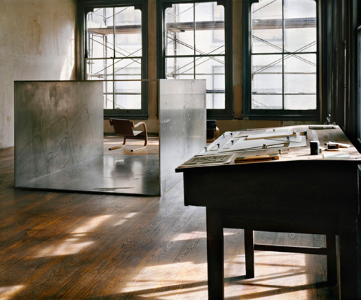
FAYLAND HOUSE

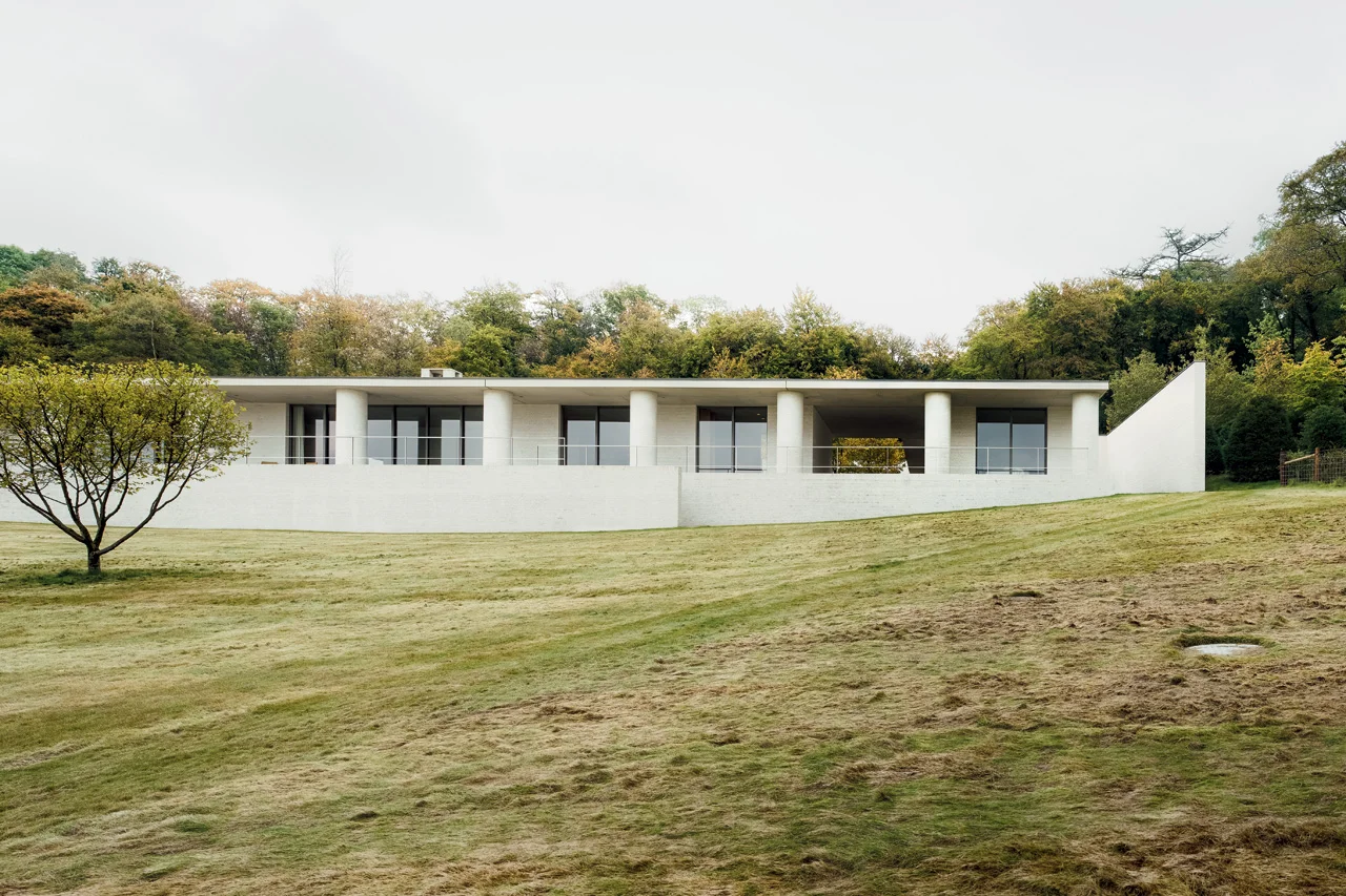
Slung over a sloped field of open ground poised to bloom with wildflowers, David Chipperfield’s Fayland House begins with a concern for context and history. Looking closely, however, the house transcends those qualities in search of a classic timelessness. 

Living spaces languish alongside one another on the front, opening to the view, while ancillary spaces tucked behind rejoice in light from the courtyards. The resulting quiet interplay of interior space and varied landscapes is captured as the camera pans, silently through space in the film. The overlap of view and frame lends a quiet expansiveness to the project. 

But it is the unmodulated run of circular columns along the front of the house which most intrigues us. The chalky, mortar-sponged white-brick is heavy and full and of the earth; with a generosity which extends the house outwards to the sky. Somehow regular and yet surprising, the columns express a classicism which is beyond perception. In an article in Architectural Review, Ellis Woodman perceptively suggested the effect of the columns is similar to the effects cultivated by the work of artist Donald Judd. He concluded his thoughts with a grace so deserved by the building that I cannot help but defer to him here:

The abiding impression is therefore one of invitation to movement. It is a house where one lives on one’s feet and takes pleasure in the constantly shifting relationship to the landscape beyond.

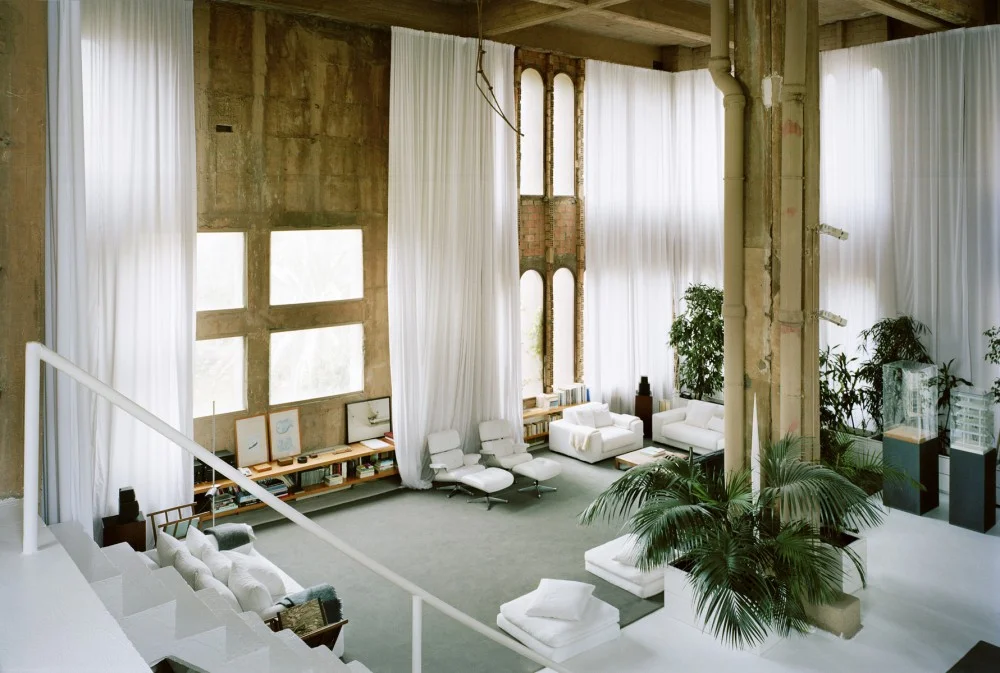
LA FABRICA

A film by Albert Moya via NOWNESS 

It's a strange thing, seeing photographs you have poured over so many times that you are certain you have discovered their deepest intricacies begin to shift before you eyes.

Albert Moya has done a simply beautiful job of transforming one of my favourite collections of images - stills, almost stills, and slow panning shots - into a sense of the quality and sequencing of this immense space. This short film outdoes photographs in ways I could not have imagined.

Within the raw shell - those curtains, that lush greenness, the furnishing! Suddenly Bofill's place has a denseness to it. It is full of space and possibility.

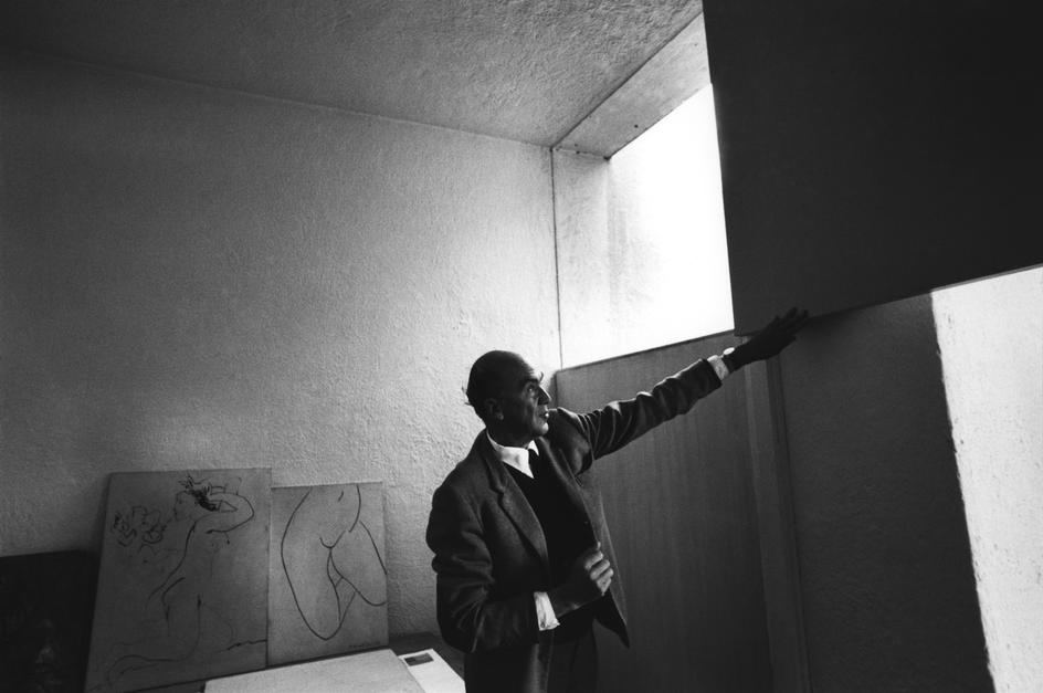
Bofill says it best himself:

It’s here where I know how to live, here where I know how to work
Where I start to think and project, my life is always made up of projections,
because the profession of architecture leads you to project the future,
so this influences your own mind
My life is always a project moving forward,
more than a story from the past

The idea of a space which helps you to understand what it means to march through life as yourself - a space which just fits - that's a fairly wonderful thing to be searching for.


AFTER FOG, ARCHITECTURE

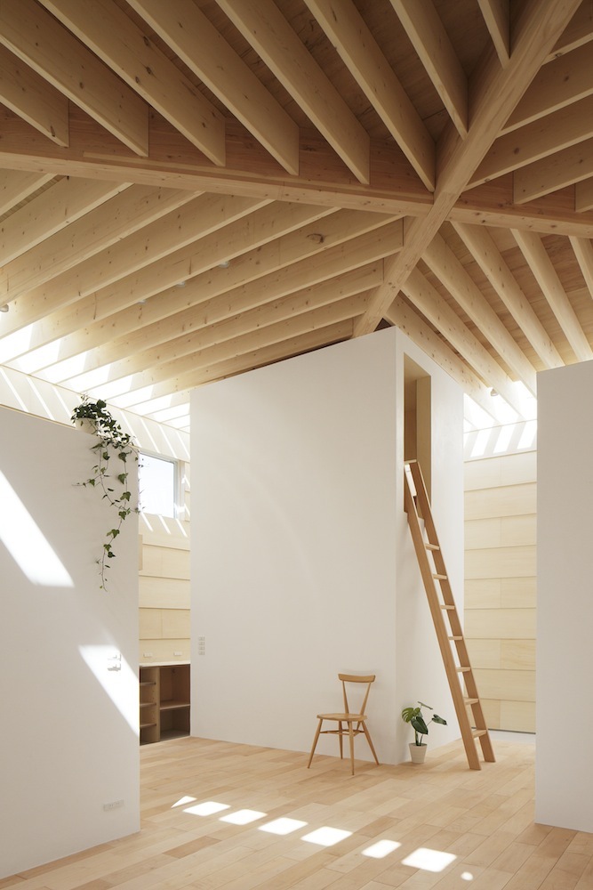
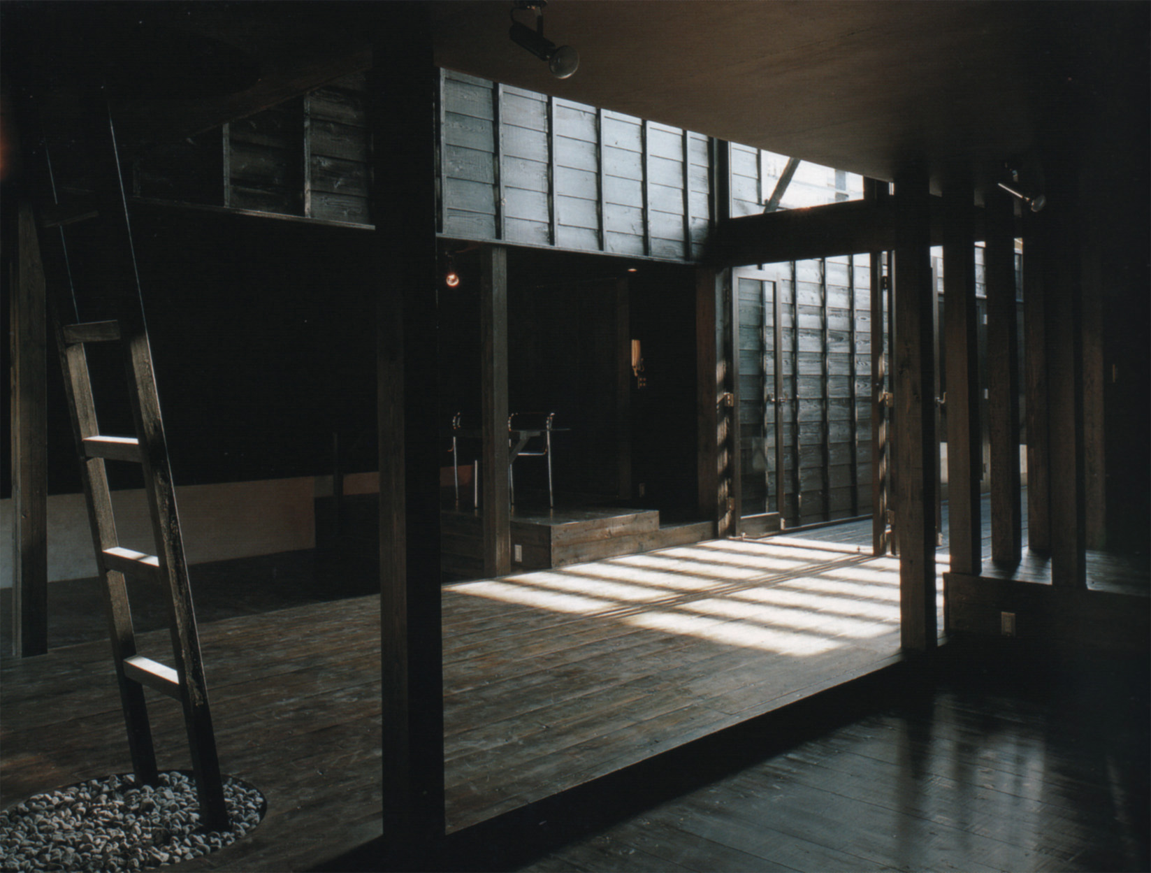
Light Walls House / mA-style Architects / Toyokawa, Japan / 2013

Light Walls House / mA-style Architects / Toyokawa, Japan / 2013

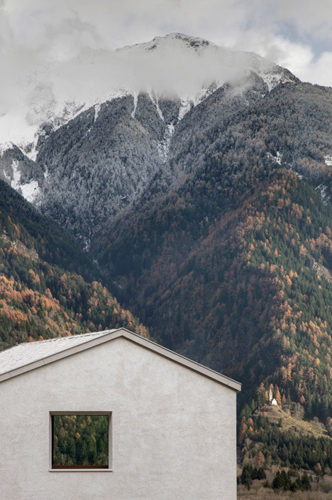
Monday morning, we awoke to a deep fog, and moved our bodies best we could through the narrow visible space by slowly identifying known objects. Door, handle, car, tree trunk, car. For a long while, the sky escaped us.

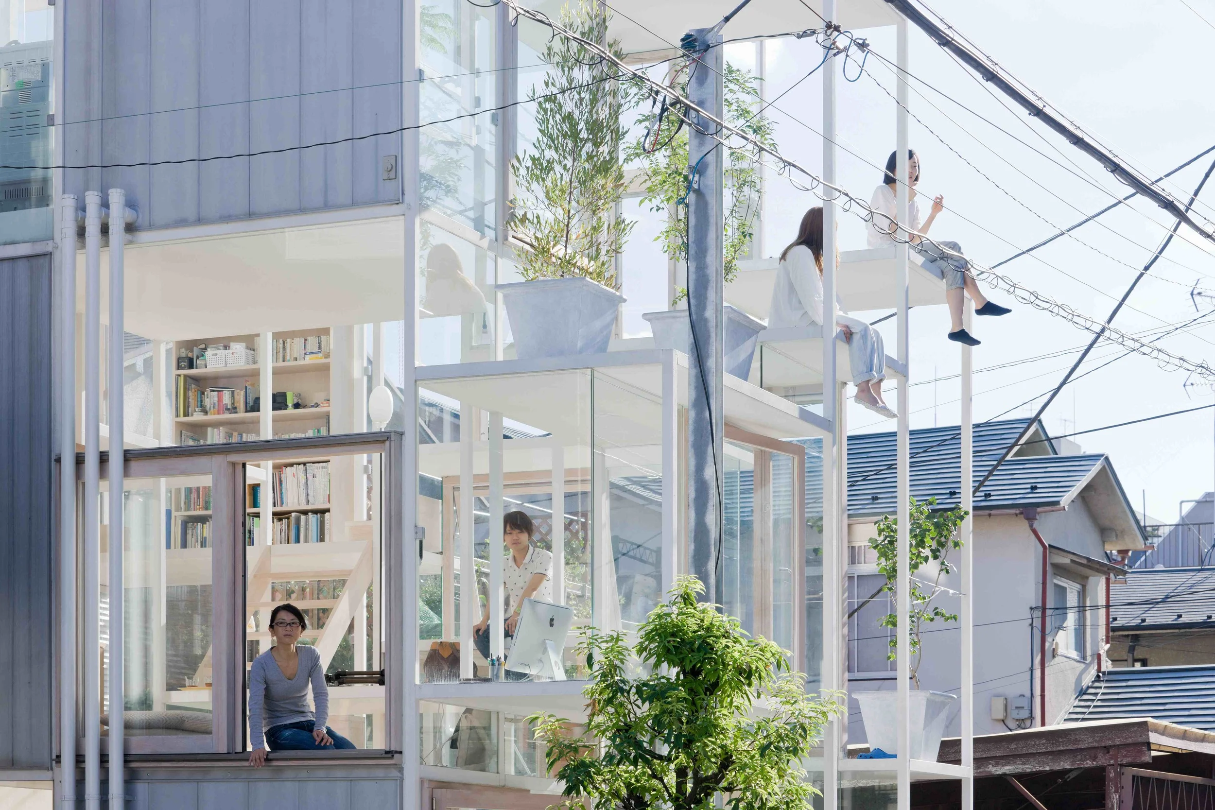
Later, as the office bathed in the sun of deep winter, the sensation of objects set within thick air stayed with me. I thought about thick space overhead, about articulated ceiling planes and limitless horizons. It's something the Japanese seem to do well, carefully placing discrete, often white cuboids beneath these billowing man-made skies.

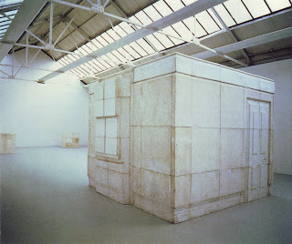
Towada Community Plaza/ Kengo Kuma / Towada / 2014

Towada Community Plaza/ Kengo Kuma / Towada / 2014


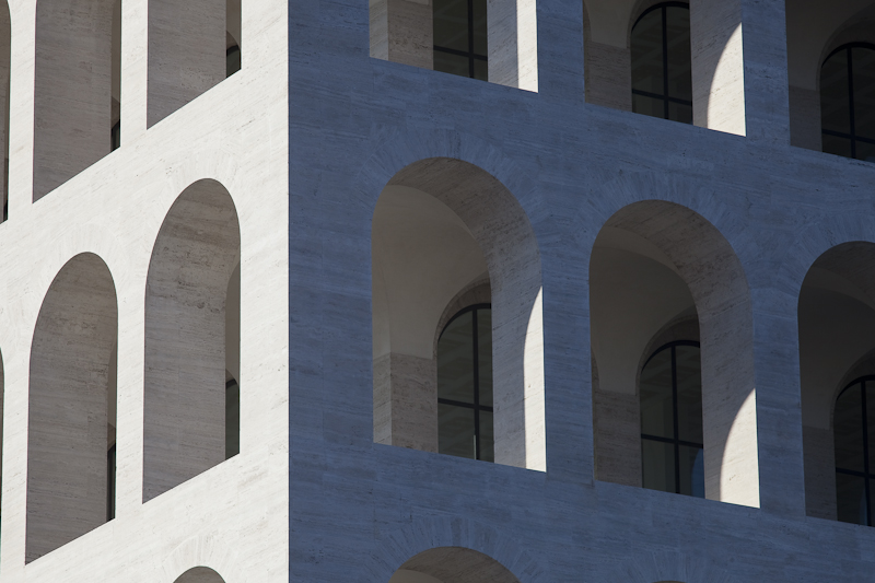
PALAZZO DELLA CIVILITA DEL LAVORO

Palazzo della Civilita del Lavoro as captured by Architectural Photographer Claudio Olivia.

Palazzo della Civilita del Lavoro as captured by Architectural Photographer Claudio Olivia.

Planned for the 1942 World Exhibition as a celebration of the Colloseum, the iconic pallazo was Mussolini’s architectural symbol of his Fascist world. In simplified neo-classical style, the superimposed loggias of the travertine-marble clad building make it as distinctive as it is mesmerising.

This year, fashion giants Fendi took over space as their headquarters, and will inhabit it for the next 15 years at least. Fendi intend on opening the ground floor up to house exhibitions celebrating Italian craftsmanship.

Palazzo della Civilita del Lavoro as captured by Architectural Photographer Claudio Olivia.

Palazzo della Civilita del Lavoro as captured by Architectural Photographer Claudio Olivia.

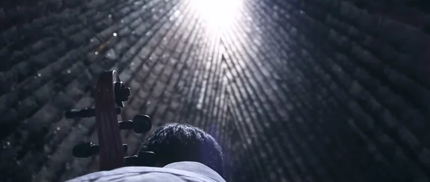
CELLO IN THE CHARRED CHAPEL

Sometimes you come across someone doing something that makes you sigh. 

German-Korean musician Isang Enders' rendition of Bach’s Cello Suite No. 1 within the sacred, charred interior of Peter Zumthor’s Bruder Klaus Field Chapel is one of those moments you can't help but wish was quietly, selfishly your own. 

It's been a long time since I list picked up a bow and drew it across the strings of my cello. Re-establishing my love for playing that deep, aching instrument has been on my list for quite a while now. But the things that make cellos so human - their size, weight, and equal parts fragility and strength, also make them cumbersome additions to the life of a 25-year old who rents her home and doesn't know where she may move to next.

So in the cello-less meantime, playing the piano in some of my most revered architectural spaces seems like a bucket list worth pursuing. The trick is just going to be getting myself, and the piano, there. 

After that, those encompassing forever moments will come easy.

H&dM

THELIMNBLOG-H&DM
In practice, a focus on experience is usually code for irregularity, pure and simple. This was a major discovery of the picturesque: buildings resembling a collision of irregular volumes produce pleasing visual variety. The idea is to disallow a Gestalt reading of a strong form that would get in the way of a non-predetermined unfolding of experience. Herzog & de Meuron rely on a more difficult and dangerous strategy: the Parrish Art Museum needs an initial Gestalt reading — the iconic extrusion set in the landscape — in order to subvert it, creating a sense of surprise upon the discovery of an architecture that is not reducible to a simple figure. It is both a strong form and an experience that cannot be understood in these terms alone. 

Matthew Allen has written a wonderfully delicate, restrained and thoughtful critique of Herzog and de Meuron's Parrish Art Museum for

Domus. 

HANDS ON

Perhaps, in a blustery southerly later this year, when you find yourself wandering into the Supreme Court in search of warmth, you will raise your hand and set it, fingertip to fingertip, on the copper against the print of some other person who has been here and admired this place before you.

Thoughts a Year on from the Supreme Court Opening
- 30 June, 2011

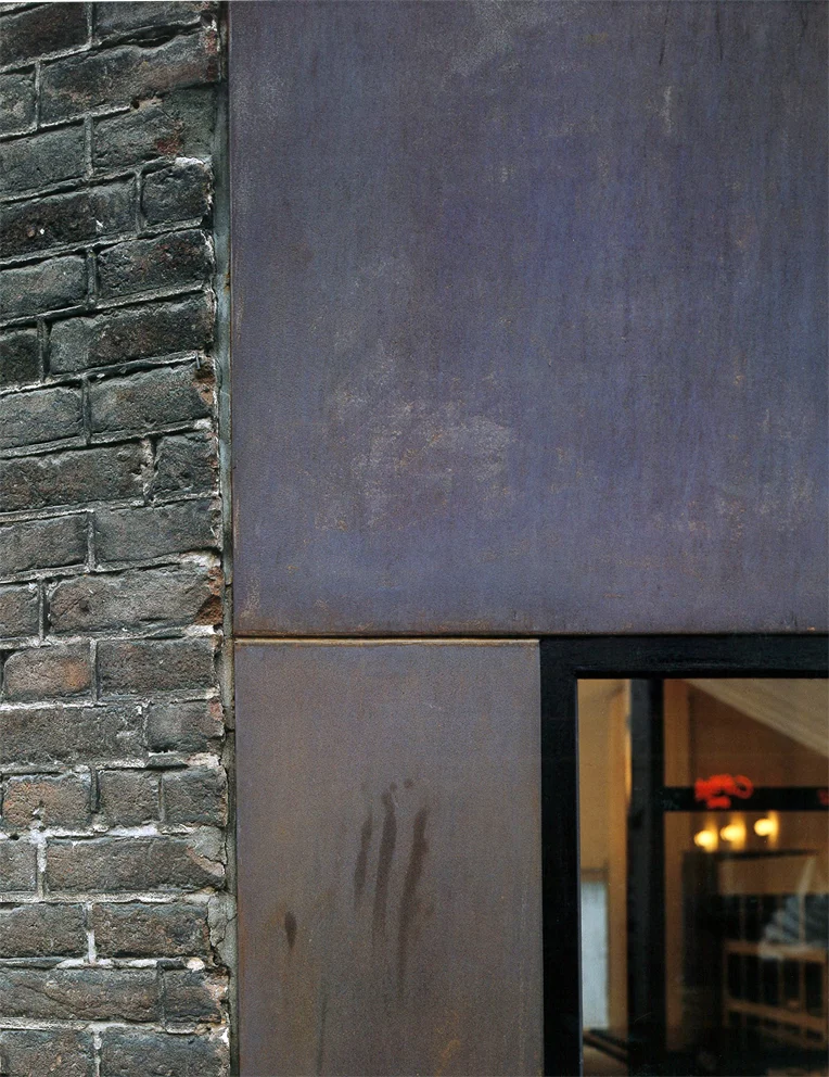
It is not easy to avoid hands when you design a building. A little over a year since the opening of the Supreme Court and the adjacent newly-refurbished Old High Court in Wellington and this much is clear. Step inside the Supreme Court and there in front of you, all over the copper-clad shell of the court room, are handprints. Hundreds of them. Smudged, smeared, but definitely handprints. Curiously though, if you step inside the newly-refurbished Old High Court, a building with 120 years of use, you will struggle to find a mere fingerprint.

From the outside, there is little astonishing about the Old High Court building. Where it once would have boasted harbour frontage, its vista today is crowded out by the high rises of the 1980s which make a mockery of its classical arches and hoods in the name of post-modernism. Amidst this sea of new buildings, it is difficult to spot the relatively modest Old High Court. Instead of opening out to the lively, pedestrian Lambton Quay, the entrance is on the less-used Stout Street: less used, because Stout Street happens to be notorious for its wind funnelling functions – a notoriety difficult to earn in the typically blustery capital.

Despite today’s appearances, in 1881, when the High Court was first opened for a service to justice that would last over a century, the classical masonry building would have been a beautiful rarity. Due to flexibility in earthquakes, the majority of building work being undertaken in Wellington at the time was in timber. In fact, the High Court was the first major masonry building commissioned by the New Zealand Government. Architect P.F.M Burrows referenced a highly academic classical style, imbuing the building with dignified proportions, hooded windows and Corinthian pilasters. With its T-shaped plan and hand-sculpted keystones, the High Court brought an exotic taste of the great Italian architect Antonio Palladio to Wellington.

Yet it is the inside, the curved double stairs leading to the public gallery, the detailed carved timber frieze and the broad judge’s bench which give the building its real value. These dark timber rooms were touched by the hands of judges and defendants, nearly non-stop at times, for over a hundred years.

In 1993, a more modern, more spacious High Court meant that permanent use of the Old High Court stopped, and by 1999 the gates were locked for good. For over a decade, the building sat listlessly, completely untouched. Without a daily, or even weekly hand caressing the hundred year old door knocker and tracing the double-curvature of the dark timber banisters, the building fell into degradation.

On the outside, restoration was needed to defeat the effects of time and weather: inside, extensive foundation work was required to make the building earthquake proof – if such a certainty is ever possible. To do so the entire building was raised off its foundations and ‘base isolated’, meaning it is essentially put on a layer which, much like jelly, allows the ground to move separately beneath it. The worn interior panelling was replaced with matching native timbers, and modern technology was woven through the thin walls. Every surface was scraped clean, returned to the untouched building of 1881.

This restoration was completed alongside the development of an adjacent plot of land – what had been an almost equally derelict park – into a building housing the newly formed Supreme Court of New Zealand.

When the buildings were formally opened on the 18th of January 2010, Prince William shook hands with Prime Minister John Key. Prince William’s outreached hand recognised, even congratulated, New Zealand as an independent nation. Prior to 2004, cases that passed through the High Courts and the Courts of Appeal in New Zealand were resolved by a Judicial Committee of the Privy Council, in London. The Supreme Court, initiated as a homeless entity in 2004, recognised New Zealand as an independent nation, no longer needing to rest on the crutch of Great Britain to resolve judicial matters.

Bound up in these questions of independence, nationality, identity and justice, the Supreme Court always had to have high ambitions architecturally. Money was not spared, and the public have been equally open-handed with their criticism. Most of the negative voices have been directed at the 90-tonne bronze screen, patterned and inset with reddish-florets to resemble the pohutukawa and rata trees which grow in the North and South Islands respectively. The public seem unconvinced by this image translation, by the cost and by the sheer massiveness of the screen, which wraps the entire second floor of the two storey building.

Under this screen, the ground floor is open and transparent, working to make justice more accessible. The glass walls are flanked down all sides by large concrete columns. Unlike the columns of the Parthenon in Athens, which taper upwards so that the top is narrower than the base, increasing the effect of perspective and making the columns seem taller and more slender than they actually are, the Supreme Courts boasts columns which taper downwards. The result is that each of the perimeter columns standing outside the building and supporting the second floor looks stout. Rather than appearing to float, as Le Corbuiser’s similarly-proportioned Villa Savoye did, the Supreme Court is heavy, squashing the open ground floor from above.

But the Supreme Court is still a new neighbour, and it will take a good many years before we really see how it gets on with the other buildings in the street. When you enter, there is a small pamphlet (which neatly pops out to eight times its size) explaining the building, from the plan to the copper shell concept. Certainly, hands have been clapped for the intricate geometries achieved in the construction of this copper-shell court room, whose interior is sheathed with timber diamonds, a design supposedly derived from the kauri cone shell. Heads have nodded to the energy efficiency of the building, whose raised moat helps to regulate temperatures, and to the relationship of the new building to the old, most evident in the symmetry of the plan.

But few, neither critics nor admirers, have had much to say about the experience of entering the Supreme Court. Is it a nice place to be? What no one talks about is whether, after shaking hands with one another on that warm day in January, Prince William and John Key walked up to the great copper shell and placed their hands on it, feeling the coolness radiating from it. What no one talks about is the handprints.

Tadao Ando, a well-known Japanese architect who design buildings with large concrete slabs, pours the masses of concrete in one go from ash-laden mixtures. Ash: because the fineness of the grain makes the concrete incredibly smooth. In his buildings, visitors are known to walk around with one hand running across the wall at all times. For real concrete-lovers, the touching hand might be replaced by the more intimate cheek.

So it is not odd that, given the smooth, voluptuous egg-like shell housing the court room, visitors are drawn to placing their palm on its curvature. Despite all the sniggering that accompanied the unveiling of the bronze screen, people feel something for this building. They want to reach out and touch it.

What is odd is that in an institution of law and order, the smudges of the hands of the people are never wiped clean. Perhaps someone has realised that it is these smudges, these hand prints and finger smears, that link stubby concrete columns, a copper shell and bronze screen to the people of today; and that it is the people, the users, who make a building what it is.

Copper, you may know, turns green with age. This is called a 'patina', and it is why the great cathedrals of Europe have brilliant verdant green roofs - they were once copper. In buildings, this process is known as ‘weathering’ because it is commonly caused by exposure to the elements: sun, wind, and rain. Across Europe, ancient and much adored sculptures have had their busts and buttocks rubbed to a shine by the hands of visitors. A fourth, less-discussed element also causes weathering: people.

In the restoration of the Old High Court, the weathering of people, the marks of our predecessors, were removed. Perhaps when someone looks at the Supreme Court in 120 years, they will notice a green tarnish encircling the copper shell, greenest at about 1.5m above floor level. Perhaps, in a blustery southerly later this year, when you find yourself wandering into the Supreme Court in search of warmth, you will raise your hand and set it, fingertip to fingertip, on the copper against the print of some other person who has been here and admired this place before you. The most satisfying part of architecture is not how it looks, or how technically advanced it is. The most satisfying part of architecture is how it connects us to others before us, around us, and after us.