FAYLAND HOUSE

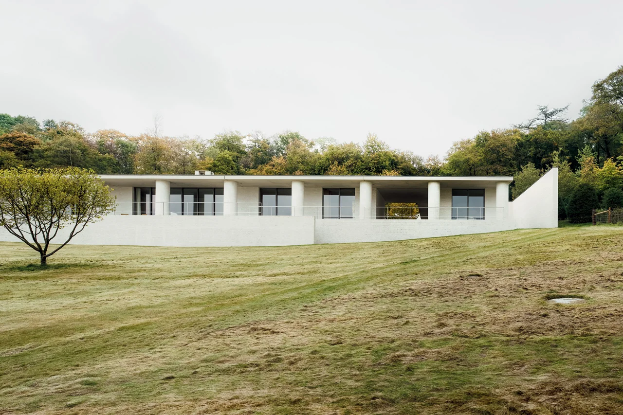
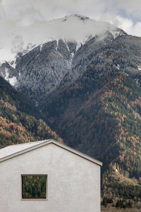
Slung over a sloped field of open ground poised to bloom with wildflowers, David Chipperfield’s Fayland House begins with a concern for context and history. Looking closely, however, the house transcends those qualities in search of a classic timelessness. 

Living spaces languish alongside one another on the front, opening to the view, while ancillary spaces tucked behind rejoice in light from the courtyards. The resulting quiet interplay of interior space and varied landscapes is captured as the camera pans, silently through space in the film. The overlap of view and frame lends a quiet expansiveness to the project. 

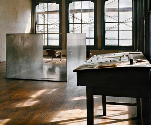
But it is the unmodulated run of circular columns along the front of the house which most intrigues us. The chalky, mortar-sponged white-brick is heavy and full and of the earth; with a generosity which extends the house outwards to the sky. Somehow regular and yet surprising, the columns express a classicism which is beyond perception. In an article in Architectural Review, Ellis Woodman perceptively suggested the effect of the columns is similar to the effects cultivated by the work of artist Donald Judd. He concluded his thoughts with a grace so deserved by the building that I cannot help but defer to him here:

The abiding impression is therefore one of invitation to movement. It is a house where one lives on one’s feet and takes pleasure in the constantly shifting relationship to the landscape beyond.

AFTER FOG, ARCHITECTURE

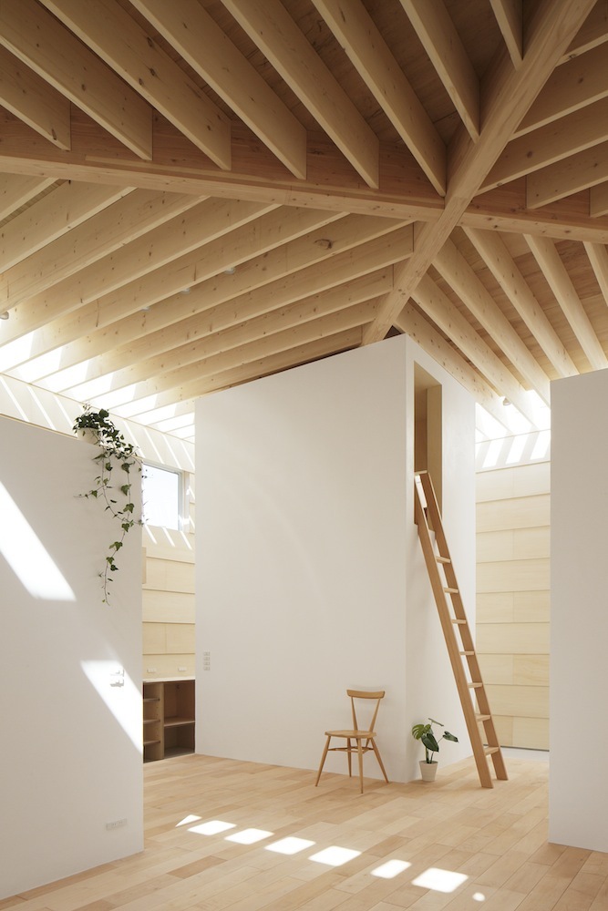
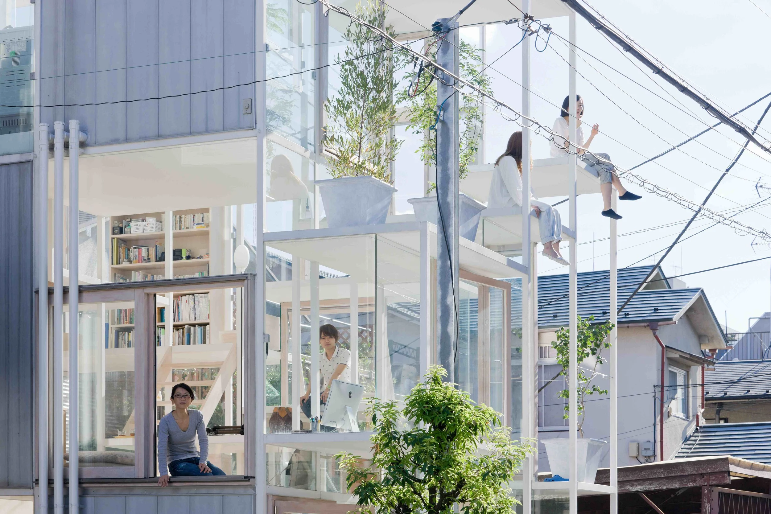
Light Walls House / mA-style Architects / Toyokawa, Japan / 2013

Light Walls House / mA-style Architects / Toyokawa, Japan / 2013

Monday morning, we awoke to a deep fog, and moved our bodies best we could through the narrow visible space by slowly identifying known objects. Door, handle, car, tree trunk, car. For a long while, the sky escaped us.

Later, as the office bathed in the sun of deep winter, the sensation of objects set within thick air stayed with me. I thought about thick space overhead, about articulated ceiling planes and limitless horizons. It's something the Japanese seem to do well, carefully placing discrete, often white cuboids beneath these billowing man-made skies.

Towada Community Plaza/ Kengo Kuma / Towada / 2014

Towada Community Plaza/ Kengo Kuma / Towada / 2014


COS x Snarkitecture

In celebration of Salone del Mobile

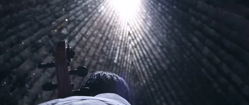
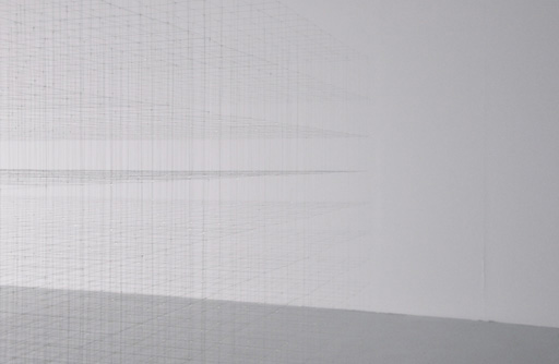
In celebration of this year's Salone del Mobile, modern-classic Swedish clothing brand COS have partnered with New York-based Snarkitecture to produce an ethereal installation. Inspired by the Spring/Summer 2015 COS Collection, the installation takes the form of a kind of cavern, inverting space and form. Rather than focusing on the ground, or our eye-level, Snarkitecture have hung individually cut ribbons as if from the sky, removing the ceiling plane from our view. In their thousands, the white ribbons describe a hovering mass, while their different lengths generate an undulating and porous surface which flows above and around the occupants. As our space for occupation is squeezed between the horizontal floor and this undulating surface, it gains definition - we are aware of it.

At times transparent, at times opaque, our relationship with the material of the ribbons also changes based on our proximity. The softly hanging ribbons generate a porosity which invites engagement. Our movements through the 'rooms' of space cause the boundaries of the installation to become blurred. As we walk past each ribbon, the surface can't help but shudder. Each ribbon is understood individually, then as part of a surface, and then becomes invisible as we align our bodies to it.  

The experience is immersive, and our reactions to it are primal and ethereal at once. We feel as if we have been here before. We move as if we know it well.

SECTION HOUSE

Section House - The Cloud Collective, 2010.

Section House - The Cloud Collective, 2010.

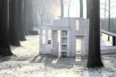
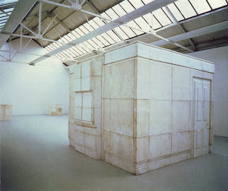
The Cloud Collective's Section House, located on a public green strip in Oisterwijk is just that: a physical, dense section through a typical house. It seems to exist halfway between building site and ruin, halfway between house and playground, halfway between real and unreal.

Ghost - Rachel Whiteread.

Ghost - Rachel Whiteread.

It recalls Whiteread's Ghost- though what is given material presence is not negative space, but the cut of the section. We feel, in it, the resistance of lost matter meeting matter. The drawing is firmly in control of the material - the projected slice is given weight beyond itself.

 Catherine Ingraham , in an essay titled Losing It in Architecture has called the architectural drawing a lament. Here, indeed, we see the architect's marks stand in for his absent object, calling it into presence. At the same time, the structure breaks no rules, rather, the logic is misapplied, drawn out from itself. The delight is in what the conventional can allow when we engage with it critically.

The Section House acts as an operator, what Stan Allen might call a 'transaction' between the abstract realm of geometry and the material stuff of building. 

PALAZZO DELLA CIVILITA DEL LAVORO

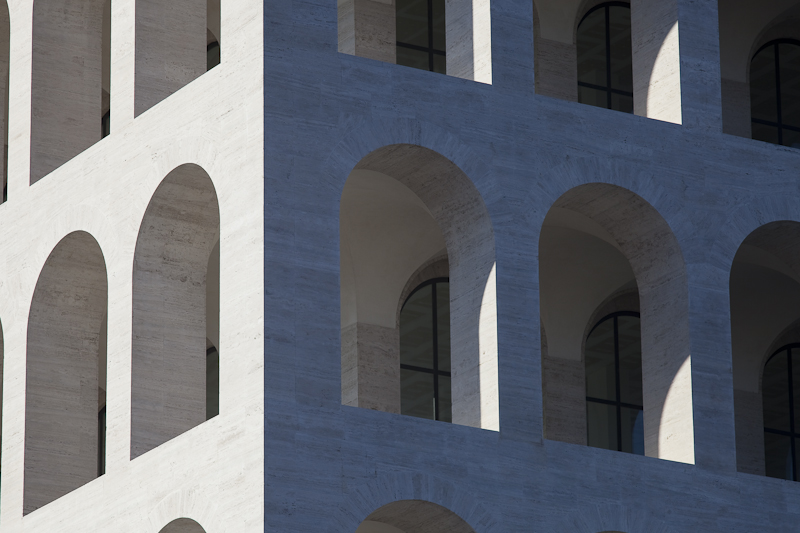
Palazzo della Civilita del Lavoro as captured by Architectural Photographer Claudio Olivia.

Palazzo della Civilita del Lavoro as captured by Architectural Photographer Claudio Olivia.

Planned for the 1942 World Exhibition as a celebration of the Colloseum, the iconic pallazo was Mussolini’s architectural symbol of his Fascist world. In simplified neo-classical style, the superimposed loggias of the travertine-marble clad building make it as distinctive as it is mesmerising.

This year, fashion giants Fendi took over space as their headquarters, and will inhabit it for the next 15 years at least. Fendi intend on opening the ground floor up to house exhibitions celebrating Italian craftsmanship.

Palazzo della Civilita del Lavoro as captured by Architectural Photographer Claudio Olivia.

Palazzo della Civilita del Lavoro as captured by Architectural Photographer Claudio Olivia.