IMPRESSIONS

 
Left: Claude Monet, The Gare Saint-Lazare (or Interior View of the Gare Saint-Lazare, the Auteuil Line), 1877, oil on canvas, 75 x 104 cm (Musée d’Orsay)  Right: Diller Scofidio and Renfro, Blur Building. Photography by Beat Widmer and Dirk Hebel.

Left: Claude Monet, The Gare Saint-Lazare (or Interior View of the Gare Saint-Lazare, the Auteuil Line), 1877, oil on canvas, 75 x 104 cm (Musée d’Orsay)
Right: Diller Scofidio and Renfro, Blur Building. Photography by Beat Widmer and Dirk Hebel.

When travelling I can't help but hold in one hand the place before me, and in the other, the image of something else I have seen somewhere else. I think of it as an act of pairing, this habit I make of attaching the unknown to a known. I think I established this habit, subconsciously, as a way to both generate meaning, and to locate myself.

In June of 2018, alone in London, I went a Monet exhibition at the National Gallery. The exhibition was entitled Monet and Architecture and so, these being two of the most personally-defining words in my life, I could not not go.

But, being present there, in London, with a selection of Monet paintings, beneath the ground in the National Gallery, hours passed and I was still trying to grasp it. I was alone and I was felt I was no-where.

The exhibition was supposed to be about architecture, but it was more about the dissolution or impression of architecture. So much so that there was almost no way of pairing the atmosphere and affect of it all. For a long time I struggled for reference points. There was no daylight in the gallery and I lost my feel for the hour.

Then, as other visitors moved around me, I stood still. I realised I was holding in one hand Monet, the train station, thick steam and early morning light, and in the other; Diller, Scofidio & Renfro, the still water of the Swiss lake, and just above it, the no-longer existing Blur building.

This is a pairing which is also an effect. This is how we make sense of things. We bring together the nearly understood, the blurs of human expression, and find through these connections a transcendent kind of clarity. Through these fragile impressions, we can connect worlds.

IT TREMBLES TO CARESS THE LIGHT

James Casebere: La Alberca, 2005/2006Photo: courtesy Goetz Collection 

James Casebere: La Alberca, 2005/2006
Photo: courtesy Goetz Collection 

Epilogue

Those blessed structures plot and rhyme-
why are they no help to me now
i want to make
something imagined not recalled?
I hear the noise of my own voice:
The painter’s vision is not a lens
it trembles to caress the light.
But sometimes everything i write
With the threadbare art of my eye
seems a snapshot
lurid rapid garish grouped
heightened from life
yet paralyzed by fact.
All’s misalliance.
Yet why not say what happened?
Pray for the grace of accuracy
Vermeer gave to the sun’s illumination
stealing like the tide across a map
to his girl solid with yearning.
We are poor passing facts.
warned by that to give
each figure in the photograph
his living name.
— Robert Lowell

A painter's vision is not a lens. Except, in the case of James Casebere, when it is.
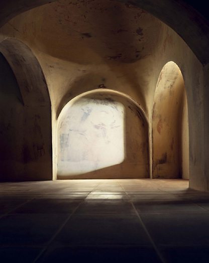
Following this, it is relatively easy to say that his images are heightened from life, yet paralysed by fact. His images trounce the real, they are contaminated by fiction. Is it photo, is it painting? The illumination characteristic of his work is at its most ambiguous in La Alberca. Here, the combination of the abstract, shallow reflective pool of water melts all solidity, returning the physical to its liquid state. The source of illumination is not clear - we are contained in the gestural space.

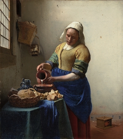
To talk about La Alberca with Lowell's Epilogue hovering at the front of my mind directs me to a correlation between Vermeer and Casebere. I note that Vermeer's work nearly always contains a window - an explicit announcement of the how and why light enters. Casebere, conversely, is not concerned with the entry of light, but with the what the illumination allows.

But even this distinction is not as clear as it might appear. Both artists obsess over how light returns the eye to reality - both artists tremble to caress the light. For Vermeer, painting the everyday Milkmaid was a subject of both stark reality and highly institutionalised myth. His illumination works to bring together these two isolated views. For Casebere the same is true - light folds together the reality of space and the myth that physical material alone is form giving.

Vermeer, The Milkmaid

Vermeer, The Milkmaid

Casebere, The Flooded Hallway

Casebere, The Flooded Hallway

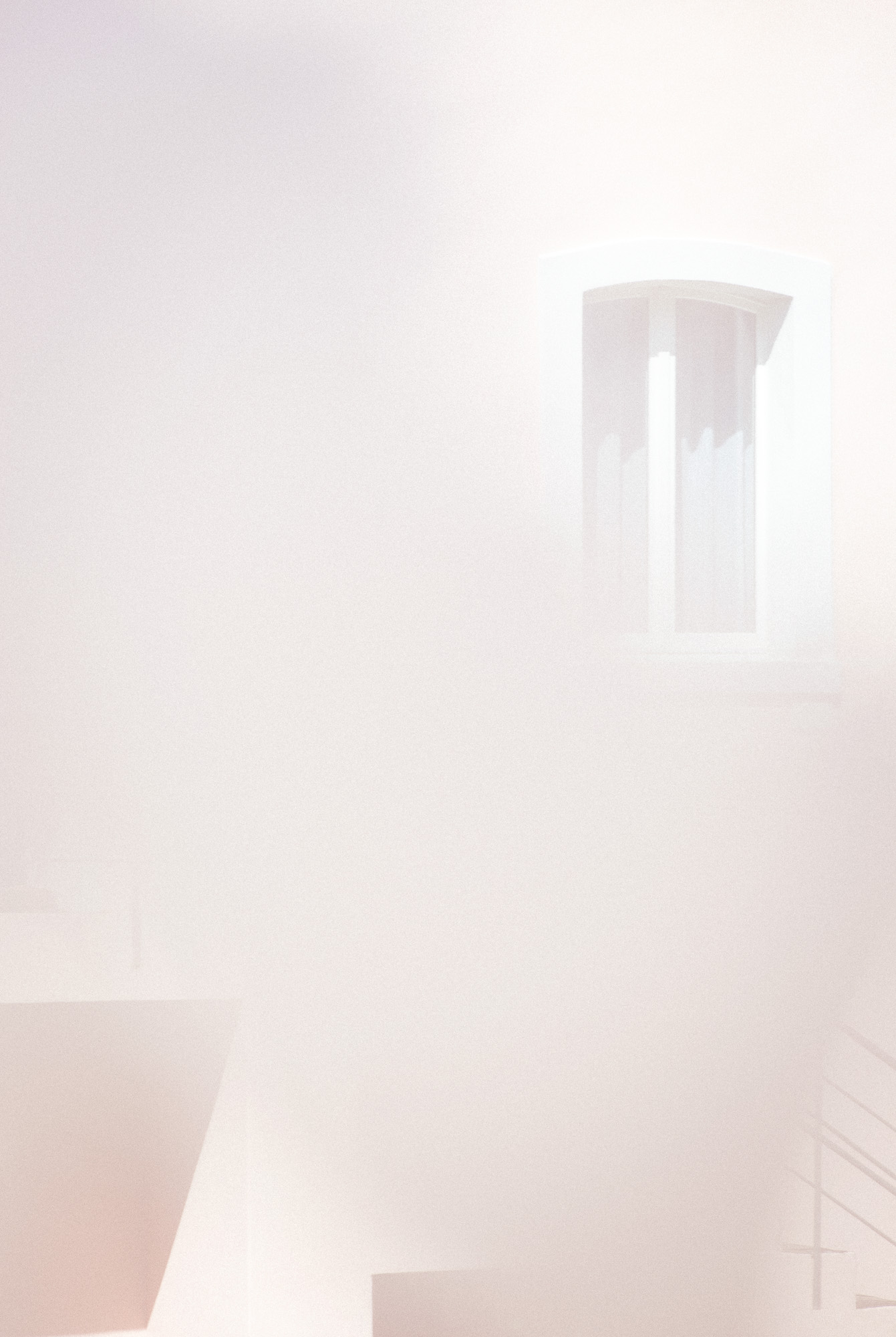
Casebere.

Casebere.


LOST LOVES

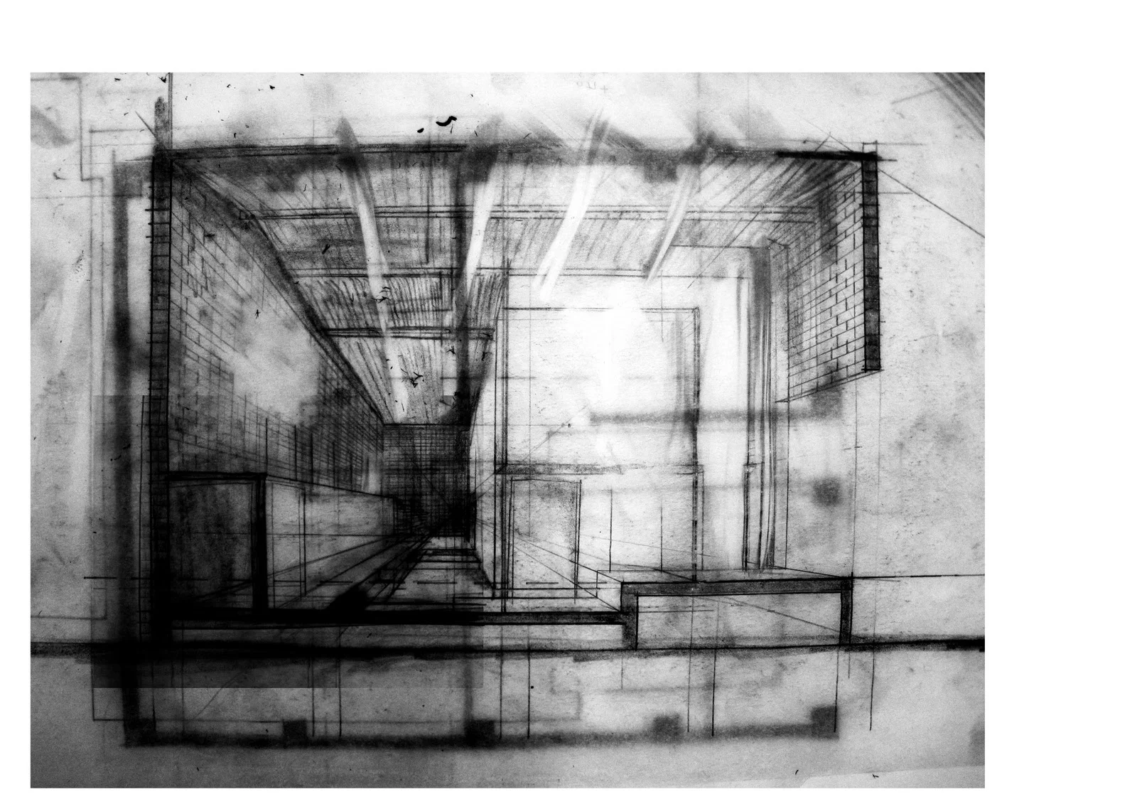
sophie_hamer_architect_section_drawing_blur_1
Identity is a graveyard of lost loves and former identifications.
— Freud, once upon a time.

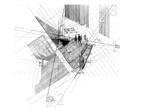
Recently, I've dug up some old sectional drawings which eke out the bodily blur. I always find that sections are especially revealing of such identifications - they let us see through things, beyond the physical constraints, and to understand the thinness of time. The bruised pages conjure the act of production - my hands remember working over and over the paper. The physicality of the craft, the sense of self while enacting the drawing. It's inescapable. 

These drawings are graveyards of old loves, in more ways than one. 

sophie_hamer_architect_section_drawing_blur_1

FREDERIK VERCRUYSSE

From 'Tempo Polveroso' - Personal work produced during an Artist in Residency project at Vila Lena, Tuscany. 

From 'Tempo Polveroso' - Personal work produced during an Artist in Residency project at Vila Lena, Tuscany. 

Frederik Vercruysse's photographic work is an absolute joy.

From the architectural to the personal, his photographic images skilfully integrate a material clarity with atmospheric mystique. Each series draws us into a narrative with assuredness and quiet poise.  And the tones: I just can't get enough. 

See more of Frederik Vercruysse's work here

From B&B Shelter 7 - Apartment in Ghent by Belgian Designer Raymond Jaquemyns. Frederik Vercruysse

From B&B Shelter 7 - Apartment in Ghent by Belgian Designer Raymond Jaquemyns. Frederik Vercruysse

From 'Portrait of a House' - A photo project developed in collaboration with Buyse Seghers Architects. Featured in Architectural Digest Germany.

From 'Portrait of a House' - A photo project developed in collaboration with Buyse Seghers Architects. Featured in Architectural Digest Germany.

COS x Snarkitecture

In celebration of Salone del Mobile

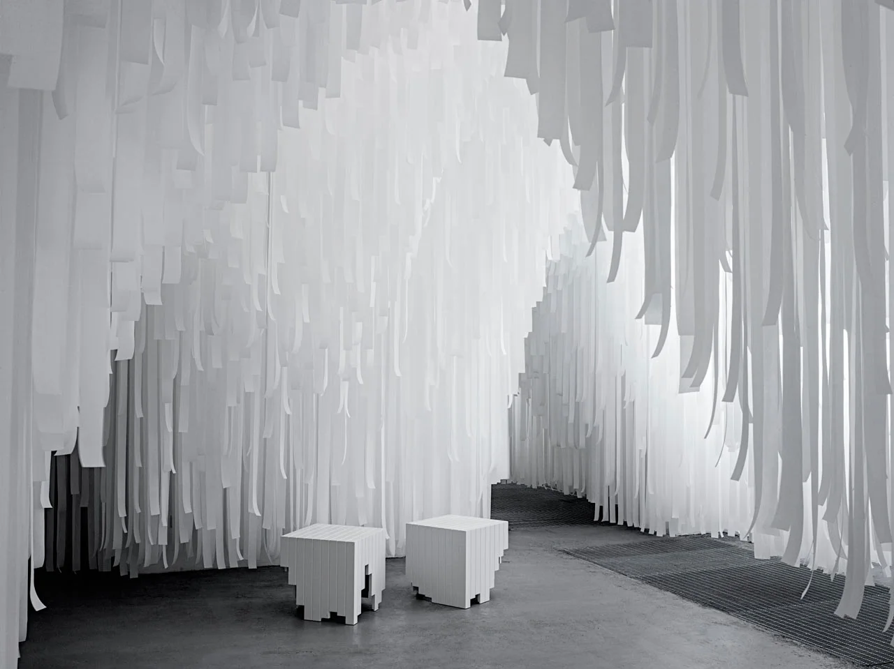
In celebration of this year's Salone del Mobile, modern-classic Swedish clothing brand COS have partnered with New York-based Snarkitecture to produce an ethereal installation. Inspired by the Spring/Summer 2015 COS Collection, the installation takes the form of a kind of cavern, inverting space and form. Rather than focusing on the ground, or our eye-level, Snarkitecture have hung individually cut ribbons as if from the sky, removing the ceiling plane from our view. In their thousands, the white ribbons describe a hovering mass, while their different lengths generate an undulating and porous surface which flows above and around the occupants. As our space for occupation is squeezed between the horizontal floor and this undulating surface, it gains definition - we are aware of it.

At times transparent, at times opaque, our relationship with the material of the ribbons also changes based on our proximity. The softly hanging ribbons generate a porosity which invites engagement. Our movements through the 'rooms' of space cause the boundaries of the installation to become blurred. As we walk past each ribbon, the surface can't help but shudder. Each ribbon is understood individually, then as part of a surface, and then becomes invisible as we align our bodies to it.  

The experience is immersive, and our reactions to it are primal and ethereal at once. We feel as if we have been here before. We move as if we know it well.

SPLASHING

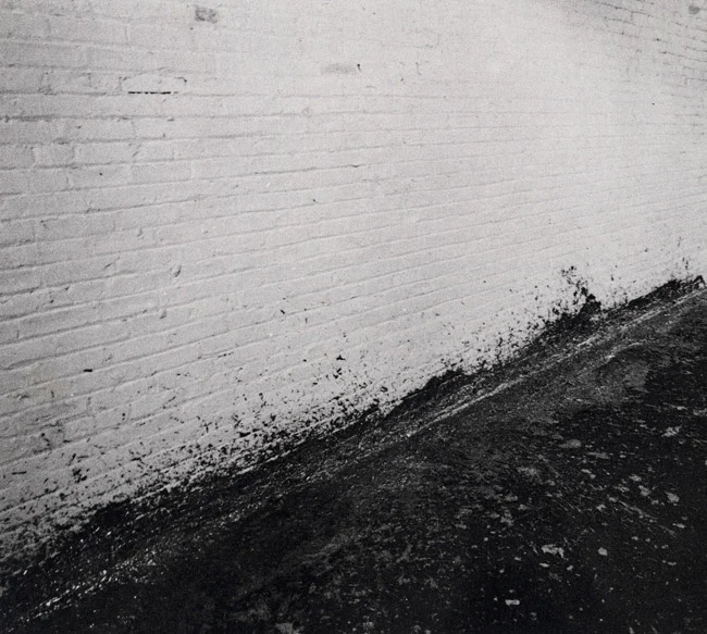
Splashing. Richard Serra, 1968.

Splashing. Richard Serra, 1968.

Richard Serra's 1968 work Splashing is one of those inherently evocative works which takes on new lives through the different media it engages. 

The process of creation is embodied in the work: hardened lead thrown against the base of a wall when molten. Once solidified, we are invited to reconstruct Serra's action in our mind. The violence of his throw is brought to life through the 'after-image' - his  performance embedded in the object.

POSTCARDS OF AMBIGUITY

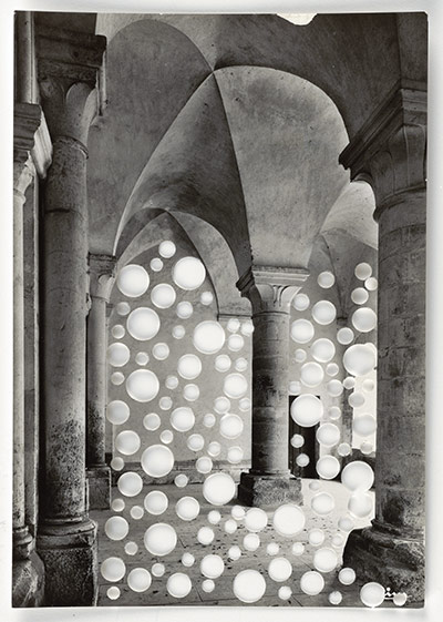
In this 'Postcard' series, Whiteread uses a hole punch to cut out negative spaces in the rooms, capturing the three-dimensional concerns of her sculptural form in a two-dimensional manner. The well-known touristic images are obscured by the cluster of circular abscesses, and they become ambiguous.  More of Rachel Whitereads' drawings at the Tate Britain courtesy of the Guardian here, with accompanying article here

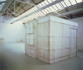
Alongside the postcards are a collection of pseudo-technical drawings, including the revealing 'Study for "House"'. In this work, Whiteread uses an everyday and meaning-laden medium - correction fluid, or 'twink' - to simultaneously create and erase. The house is 'corrected' into a 'pure' whiteness, it becomes absent, yet at the same time, we are more aware of the space the object occupies after the 'intervention'. White is at once pure and ghostly, the house in the images becomes both nothing and, oddly, sky. 

Study for "House", 1992

Study for "House", 1992

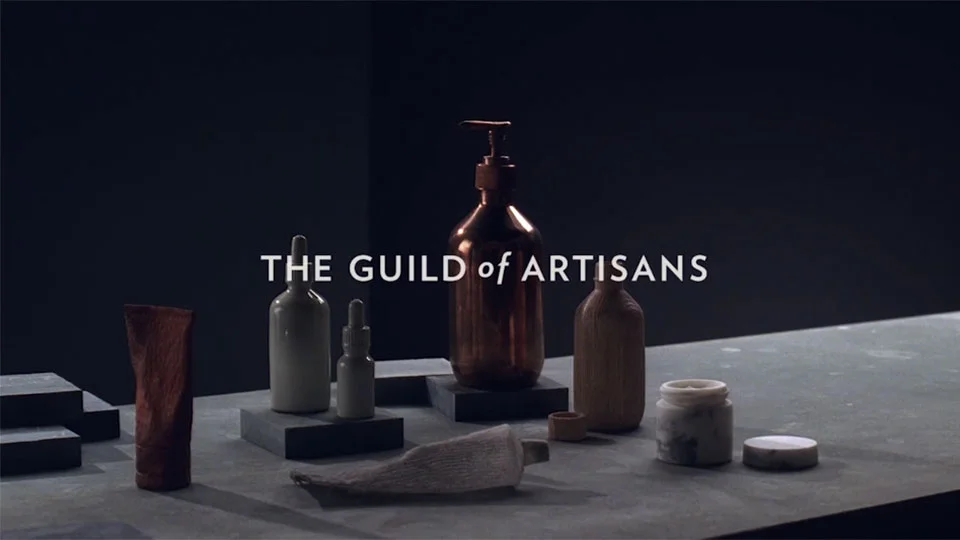
GUILD

Architectural beauty brand Aesop invite viewers into their complex, beautiful interior design and construction process in their stunning film "The Guild of Artisans". It's not often that the act of making is understood with as much delicacy as the final product - but here, Aesop pay perfect homage. The close-ups, lighting, and sequencing of the film are testament to the brand's  approach to design as a multi-sensual task.